Mobilising a Website, Part 1: The Problem
It hasn't escaped my notice that if one happens to visit Pointbeing.net - this very site - using the browser on a mobile phone, the experience is more than a little painful. In fact, more often than not, the site is simply unusable.
The reason for this is that the site does not adapt itself in any way to the smaller screens, slower connection speeds, and idiosyncratic navigation methods found in mobile devices.
In my defence, this is not unusual right now: many, many sites are in the same position (have you ever tried to visit LinkedIn on a mobile?). However, given my faith in the future of the mobile web, and also given what I do for a living [1], this is something of an embarassment. The time has come to mobilise Pointbeing.net.
The Project: Mobilising an Existing Website
Happily enough, this is an interesting problem, and not one which I've actually solved before. I've built a number of mobile web sites and applications from scratch, but I don't have that luxury here. I'm going to have to honour existing content, URLs and users.
And it's not entirely obvious how to go about it! There's a wide range of tools which we may choose to co-opt. Some of these tools, such as WURFL and Tera-WURFL, have been discussed here before, whilst others will be entirely new to me.
Furthermore, there's a variety of approaches which we can take: options include simply creating a mobile-only stylesheet, attempting to adapt the site to various devices, or creating an entirely separate mobile-specific site.
I guess that's why I'm writing this: as I mentioned, I'm not the only developer in this position, and I expect that the process is going to be a bit of an adventure. So this is the first in what I hope will become a series of several posts concerning the project. Future posts will discuss the various tools and approaches in more depth, and will follow the development process through to testing, validation and - fingers crossed - a mobile-friendly Pointbeing.net.
In this first part though, let's get an understanding of the extent of the problem, by viewing the site on a small selection of commonplace mobile handsets.
Trial by Handset: Nokia 6230i
Let's start by visiting the site using the popular Nokia 6230i. This is a simple candybar handset with a 208x208 pixel colour screen [2]. The 6230i was one of the ten best-selling handsets of 2006, so we can assume that there's a reasonable number of users out there.

Fig 1: Pointbeing.net viewed on a Nokia 6230i
Good lord, what happened there? It looks like the Nokia is doing a reasonable job of rendering the site, and is honouring the stylesheet too. The problem is that the site's dimensions are so fixed that the 208x208 screen can only display a tiny portion of the page at a time. This is known as "keyhole" mode browsing - at least on devices that let you opt out of it. Unfortunately the Nokia doesn't have this option - not least because I haven't provided any way for it to do so.
I'm afraid that for the time being, this site is effectively unusable for Nokia 6230i owners. Sorry guys.
Trial by Handset: Sony Ericsson W880i
Maybe we were unlucky, and simply made a poor choice of handset. Ever optimistic, let's try a different device from a different manufacturer: this time the Sony Ericsson W880i [3].
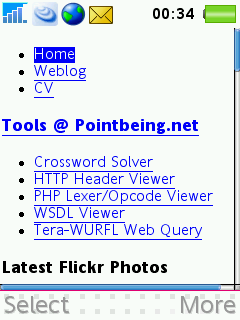
Fig 2: Pointbeing.net viewed on a Sony Ericsson W880i
Here we see very different behaviour indeed. It's interesting that the W880i happens to honour the media="screen" attribute which I've applied to my stylesheet's <link /> tag. (It's perhaps even more interesting that the Nokia did not honour that attribute). The result is that the W880i displays the whole page, with no styling rules applied. In a way, that's a pretty sane strategy.
Unfortunately, I'm not providing a user-friendly experience to owners of this handset either: the user has to scroll through list after list of links - to my Flickr photos, to Martin Fowler's "Bliki", and to other parts of Pointbeing.net - before they reach the meaty content of the page. That's no fun at all. Sorry, W880i users, I appear to have failed you too.
Trial by Handset: Apple iPhone
You'll notice that I've so far made a distinctly pedestrian choice of handsets, and I think that I'm right to: whilst your marketing department may all be kitted out with iPhones and Blackberries, the 6230i and the W880i are the kind of phones that are in the hands of real users - especially amongst youngsters and in the developing world, the two key demographics which are adopting the mobile internet in droves.
Still, for the sake of completeness, let's have a look at the site using the Jesus phone itself: Apple's fabled iPhone [4]. I'll connect over wifi, since the £369 iPhone doesn't have 3G. (And don't get me started on those headphones).
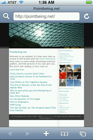
Fig 3: Pointbeing.net viewed on an Apple iPhone
As much as I'd love to criticise the iPhone, I have to admit that it does a pretty swell job of displaying the front page, albeit somewhat squashed into a few hundred pixels. I don't have a teenager present, so I can't work out how to use the multi-touch interface to zoom in. But I'm led to believe that it's quite possible.
Still, the fact remains that rather than providing a tailored, mobile-friendly experience ourselves, we're relying on the device to take care of the usability, and we're expecting the user to drag, point and zoom their way around the page. I consider myself pretty switched on when it comes to gadgetry, and yet I can't work out how to do it.
All the same, the iPhone admittedly provides by far the best experience of the three handsets. I won't get too excited though, because as it stands, the only person ever to have visited this site using an iPhone is - you guessed it - me.
Conclusions
Well, that was fun. We've learned that the site is effectively unusable on all but the priciest of mobile handsets, and even then it's a bit of a chore. My ego has taken something of a blow, so I need to crack on with mobilising the site.
I do hope you'll join me for part 2 where I'll weigh up the various strategies and approaches which can be employed to make an existing web site mobile-friendly.
Footnotes
[1] If you hadn't guessed, I'm a programmer. I'm currently working for PlayPhone, a major player in the mobile entertainment field. Needless to say, a large part of my day involves working on mobile web projects.
[2] Full details of the Nokia 6230i's specs from Tera-WURFL.
[3] Full details of the Sony Ericsson W880i's specs from Tera-WURFL.
[4] Full details of the Apple iPhone's specs from Tera-WURFL.