Weblog
"PHP Tools for Mobile Web Development" Published
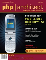
This is just a quick heads up to say that my article, "PHP Tools for Mobile Web Development" has today been published, and is currently gracing the cover of July's php|architect magazine.
Of course, I jinxed things a little by blogging that it would be published in June, but never mind, we got there.
Big thanks must go to Ciaran for giving the initial draft the once over (on a related note, check out Ciaran's post about web development for the iPhone). Thanks also to my occasional colleague Gerard for clueing me in to the fact that the damn thing had been published.
For what it's worth, php|architect is recommended reading even when I'm not in it, so get yourself over there and get subscribed!
Ok...now to crack on with that second article...
Mobilising a Website, Part 2: Strategies
In Mobilising a Website, Part 1: The Problem I noted that this site is practically unusable when viewed using the browser on a mobile handset, and that I'd like to do something about that.
This time around, I'd like to size up some of the approaches and strategies that developers can take in order to make an existing website mobile-friendly.
Option 1: Do Nothing
It may sound flippant, but in the world of development, the option of doing nothing often has to be seriously considered. Every developer out there can recount tales of ridiculous amounts of time and expense being invested in hairbrained projects developing systems that simply were not needed.
This strategy is unparalleled in its cost-effectiveness and simplicity and is naturally very, very easy to estimate and plan.
In this particular case, we could point to the fact that, as we saw, some high-end handsets do a decent enough job of displaying the site as it stands. We can confidently expect mobile browser technology to improve immeasurably over the next couple of years, so there's a lot to be said for holding off.
Unfortunately, this strategy does not solve the original problem. I want my site to work nicely for mobile users now, and it will be a long time before browsers as capable as that of the iPhone dribble down to the majority of consumers.
Moreover, I'm as interested in the process of achieving a mobile-friendly site as I am in the finished article, and that's why we're here: this series of blog posts would be rendered rather brief and anti-climactic if I were to choose the "do nothing" route!
Option 2: Add a Mobile Stylesheet
Quite a few of the problems we saw in part one, in particular those which confounded the Nokia 6230i, were related to the site's stylesheet. For example, both the fixed width of the page and the large banner images are defined in there. The former is the result of the rule width: 790px; being applied to a number of the elements within the page; the latter is specified by applying a background-image property to a <div />.
Fortunately, HTML and XHTML provide a way of specifying that a stylesheet only applies to a certain class of device. This is all achieved by applying a media attribute to the <link /> element which calls in the stylesheet.
By way of an example, the following code extract is designed to send one stylesheet to "full" or desktop web browsers (media="screen") and an alternative stylesheet to mobile browsers (media="handheld"):
<link rel="stylesheet" type="text/css" media="screen" href="full.css"> <link rel="stylesheet" type="text/css" media="handheld" href="mobile.css">
The full list of possible values for the media attribute can be found here.
Once we're serving a different stylesheet to mobile devices, we can really start to think about customising the user experience for them. For example, a mobile stylesheet could also be used to "hide" certain elements from mobile browsers, by applying a display: none; style rule to them. The long list of links in the sidebar which made the site so difficult to use with the W880i seems like a good candidate for hiding.
This strategy has the compelling benefit of simplicity. By adding one line of HTML, plus a small additional stylesheet to the site we may be able to deliver a mobile-friendly experience. Let's knock up a prototype mobile stylesheet and see how things look.
Here's a small CSS file that "hides" some of the more spurious elements of the page. I'll also specify that links should be displayed in green, purely to make it unambiguous as to whether the new stylesheet is being loaded and applied.
.sidebar {
display: none;
}
a {
color: green;
}
Remember that simply by not specifying widths, colours and background images in there, we're sidestepping a lot of the decorative fluff that was causing problems for mobile browsers.
Viewed on the Sony Ericsson, things are looking up:
Fig 1: Pointbeing.net with a handheld stylesheet, viewed on a Sony Ericsson W880i
We're successfully displaying only the main navigation, an introductory heading and paragraph, 10 links to blog posts and a footer. It's actually a really clean user experience for very little effort - I like it a lot.
Unfortunately, life isn't quite so cheerful for users of the other handsets. The experience on the Nokia 6230i and the iPhone is all but unchanged, but probably for different reasons. The Nokia does occasionally display links in green, so my hunch is that it simply does not support the media attribute, and so loads and applies both stylesheets. There's no corresponding property in WURFL to confirm it, but it certainly looks that way.
Conversely, I'm certain that the iPhone fully understands the media attribute, but considers itself to be a "real" computer. The jury's out on that one [1]. My gut feeling is that screen size should be the deciding factor in these cases, and based on that, the iPhone sits squarely under the heading of a handheld device. It's only fair to point out that the iPhone is not alone in this behaviour: the Nokia N95 and my LG KU990 behave in much the same way.
So the handheld stylesheet seemed like a great idea, but we can summarise several of the drawbacks to this approach as follows:
- Some devices do not support the media attribute at all
- Many high-end handsets completely disregard the media attribute and opt for the "full web" stylesheet
- In the cases where devices both support and honour the media attribute, we're relying on them to support CSS consistently. This is not something we can safely expect from mobile devices. For example, my first attempt was to use visibility: hidden; instead of display: none; but this was disregarded by the W880i
- Even if we hide elements by using CSS, the full page still has to be downloaded, which is likely to impose both a time and cost expense on the user. Expecting the user to download reams of markup which we don't actually want them to render seems like rather poor form. Furthermore, those full web pages may be larger than the maximum deck size which the device can support
- Pages are still not tailored to the mobile experience: Cameron Moll talks a lot about contextual relevance, and it's hard to see how my enthusiastic post about The Get Up Kids, consisting of three multi-megabyte YouTube videos embedded in the page is at all relevant to the mobile context
So this strategy isn't ideal. But for so little effort I've actually managed to make the site perfectly usable on a number of handsets. With little to lose, and with Early And Regular Delivery in mind, I'm actually going to put the handheld stylesheet in place right now, while I ponder alternative stategies.
Option 3: Allow the Site Automatically to Adapt to Devices
The principle behind this strategy is one known as "adaptive rendering". In other words, device detection would be done server-side (in my case using PHP) and the client would be sent markup and content tailored specifically to the device. I can think of a couple of ways to achieve this, although I'm sure there are plenty more.
The first option is afforded to us by the fact that the site is based firmly on the MVC pattern, which is fairly common in web sites and applications these days. MVC dictates that the business logic and data (Model), display logic (View) and application flow (Controller) be arranged into discrete components, so as to be independent of each other. In this case we're primarily concerned with the display logic, so it seems feasible to take advantage of the separation and swap in a different View component for mobile devices.
I happen to be using Zend Framework, so this could be achieved by specifying the directory in which the View should look for view scripts and helpers. I imagine it would not be difficult to do this dynamically using methods such as Zend_View_Abstract's setBasePath(), setScriptPath() and setHelperPath().
Another approach would be to adopt the "two-step view" pattern. This pattern is nicely documented by Martin Fowler in his classic Patterns of Enterprise Application Architecture, so I'll quote liberally from there:
Two Step View [splits] the transformation into two stages. The first transforms the model data into a logical presentation without any specific formatting; the second converts that logical presentation with the actual formatting needed. This way...you can support multiple output looks and feels with one second stage each
That sounds rather like what I need. I guess in terms of implementation, I'd be looking at having the first stage generating some common XML format, and then perhaps using XSL Transformations server-side in order to transform the XML into the markup which the device prefers. At the same time, I can opt not to include certain elements, such as the long list of links, in the finished pages.
Again, this can all be done within the View component of the site's code, which is rather gratifying. Still, that does seem like quite a lot of work, and I'm not sure I want to get into what would effectively be writing my own templating engine.
Option 4: Build a Separate Mobile Site
One surefire way of getting myself a working mobile version of the site would be to simply build a standalone mobile site. I've already registered the pointbeing.mobi domain name, and quite honestly do not have any better ideas for what to do with it.
The benefits of this approach would be that I could tailor the mobile site exactly the way I want it, I could roll out features incrementally, and I wouldn't risk making the main Pointbeing.net site's code any more complex than it need be. Admittedly it's pretty simple stuff right now, but I'd like to keep it that way.
I could detect mobile devices as they hit the main site (perhaps using Tera-WURFL) and forward them across to the mobile version. This is a strategy used by a fair number of large sites, such as Flickr (mobile version) and Facebook (mobile version), so it seems like I'd be in good company.
The downsides would be that I would have two sites to maintain, and that I still would not have solved the original problem, that of Pointbeing.net being a bit of a dog when viewed on a mobile browser. That said, if I leave the handheld stylesheet in place, I'd be catering to most cases.
The important thing to remember will be to always provide a link back to the full site for users who feel confident that their browsers will cope with it. I'm not interested in forbidding any users from accessing any content whatsoever: that's too much of a throwback to the dark days of the desktop web when sites would block, say, Opera users, demanding that they to "upgrade" to IE5 in order to gain access.
Conclusions
Creating a standalone mobile-friendly site - either under the .mobi domain or under an "m." subdomain - and forwarding mobile devices on to it is an appealing option, and it's the one towards which I'm leaning right now. I think...
I may well change my mind and opt for the adaptive rendering path. While that route feels a little more ambitious, I certainly would be quite proud if I could pull it off, and have the site adapt itself to devices as if by magic.
Either way, I'm going to have to put some thought into which tools and libraries I'm going to use to create mobile-friendly pages. There's a few out there, some of which I've covered on this site, some in a recent piece I wrote for php|architect, and yet others with which I'm not at all familiar.
Part 3 of this series seems like a good time to start making some decisions about toolkits, and this will in turn entail making some architectural decisions about the code behind the mobile version of pointbeing.net.
Footnotes
[1] Similarly, the debate about whether to deliver "full web" content or a mobile tailored version to such devices continues. A useful piece on the subject appeared recently over at WAP Review.
Many thanks to my colleague Dan Gent, whose remarkably well-timed loan of Cameron Moll's Mobile Web Design helped to inform this post.
Previous Posts in this Series:
Mobilising a Website, Part 1: The Problem
It hasn't escaped my notice that if one happens to visit Pointbeing.net - this very site - using the browser on a mobile phone, the experience is more than a little painful. In fact, more often than not, the site is simply unusable.
The reason for this is that the site does not adapt itself in any way to the smaller screens, slower connection speeds, and idiosyncratic navigation methods found in mobile devices.
In my defence, this is not unusual right now: many, many sites are in the same position (have you ever tried to visit LinkedIn on a mobile?). However, given my faith in the future of the mobile web, and also given what I do for a living [1], this is something of an embarassment. The time has come to mobilise Pointbeing.net.
The Project: Mobilising an Existing Website
Happily enough, this is an interesting problem, and not one which I've actually solved before. I've built a number of mobile web sites and applications from scratch, but I don't have that luxury here. I'm going to have to honour existing content, URLs and users.
And it's not entirely obvious how to go about it! There's a wide range of tools which we may choose to co-opt. Some of these tools, such as WURFL and Tera-WURFL, have been discussed here before, whilst others will be entirely new to me.
Furthermore, there's a variety of approaches which we can take: options include simply creating a mobile-only stylesheet, attempting to adapt the site to various devices, or creating an entirely separate mobile-specific site.
I guess that's why I'm writing this: as I mentioned, I'm not the only developer in this position, and I expect that the process is going to be a bit of an adventure. So this is the first in what I hope will become a series of several posts concerning the project. Future posts will discuss the various tools and approaches in more depth, and will follow the development process through to testing, validation and - fingers crossed - a mobile-friendly Pointbeing.net.
In this first part though, let's get an understanding of the extent of the problem, by viewing the site on a small selection of commonplace mobile handsets.
Trial by Handset: Nokia 6230i
Let's start by visiting the site using the popular Nokia 6230i. This is a simple candybar handset with a 208x208 pixel colour screen [2]. The 6230i was one of the ten best-selling handsets of 2006, so we can assume that there's a reasonable number of users out there.
Fig 1: Pointbeing.net viewed on a Nokia 6230i
Good lord, what happened there? It looks like the Nokia is doing a reasonable job of rendering the site, and is honouring the stylesheet too. The problem is that the site's dimensions are so fixed that the 208x208 screen can only display a tiny portion of the page at a time. This is known as "keyhole" mode browsing - at least on devices that let you opt out of it. Unfortunately the Nokia doesn't have this option - not least because I haven't provided any way for it to do so.
I'm afraid that for the time being, this site is effectively unusable for Nokia 6230i owners. Sorry guys.
Trial by Handset: Sony Ericsson W880i
Maybe we were unlucky, and simply made a poor choice of handset. Ever optimistic, let's try a different device from a different manufacturer: this time the Sony Ericsson W880i [3].
Fig 2: Pointbeing.net viewed on a Sony Ericsson W880i
Here we see very different behaviour indeed. It's interesting that the W880i happens to honour the media="screen" attribute which I've applied to my stylesheet's <link /> tag. (It's perhaps even more interesting that the Nokia did not honour that attribute). The result is that the W880i displays the whole page, with no styling rules applied. In a way, that's a pretty sane strategy.
Unfortunately, I'm not providing a user-friendly experience to owners of this handset either: the user has to scroll through list after list of links - to my Flickr photos, to Martin Fowler's "Bliki", and to other parts of Pointbeing.net - before they reach the meaty content of the page. That's no fun at all. Sorry, W880i users, I appear to have failed you too.
Trial by Handset: Apple iPhone
You'll notice that I've so far made a distinctly pedestrian choice of handsets, and I think that I'm right to: whilst your marketing department may all be kitted out with iPhones and Blackberries, the 6230i and the W880i are the kind of phones that are in the hands of real users - especially amongst youngsters and in the developing world, the two key demographics which are adopting the mobile internet in droves.
Still, for the sake of completeness, let's have a look at the site using the Jesus phone itself: Apple's fabled iPhone [4]. I'll connect over wifi, since the £369 iPhone doesn't have 3G. (And don't get me started on those headphones).
Fig 3: Pointbeing.net viewed on an Apple iPhone
As much as I'd love to criticise the iPhone, I have to admit that it does a pretty swell job of displaying the front page, albeit somewhat squashed into a few hundred pixels. I don't have a teenager present, so I can't work out how to use the multi-touch interface to zoom in. But I'm led to believe that it's quite possible.
Still, the fact remains that rather than providing a tailored, mobile-friendly experience ourselves, we're relying on the device to take care of the usability, and we're expecting the user to drag, point and zoom their way around the page. I consider myself pretty switched on when it comes to gadgetry, and yet I can't work out how to do it.
All the same, the iPhone admittedly provides by far the best experience of the three handsets. I won't get too excited though, because as it stands, the only person ever to have visited this site using an iPhone is - you guessed it - me.
Conclusions
Well, that was fun. We've learned that the site is effectively unusable on all but the priciest of mobile handsets, and even then it's a bit of a chore. My ego has taken something of a blow, so I need to crack on with mobilising the site.
I do hope you'll join me for part 2 where I'll weigh up the various strategies and approaches which can be employed to make an existing web site mobile-friendly.
Footnotes
[1] If you hadn't guessed, I'm a programmer. I'm currently working for PlayPhone, a major player in the mobile entertainment field. Needless to say, a large part of my day involves working on mobile web projects.
[2] Full details of the Nokia 6230i's specs from Tera-WURFL.
[3] Full details of the Sony Ericsson W880i's specs from Tera-WURFL.
[4] Full details of the Apple iPhone's specs from Tera-WURFL.
My php|architect Article to be Published in June
I purposefully didn't mention this here before now, as I didn't want to jinx anything.
But the time has come, and I'm pleasantly surprised to be able to report that my article - named something along the lines of "PHP Tools for Mobile Web Development" - is to be published in the June edition of php|architect magazine.
This will be my first ever contribution to php|architect, so it's a huge compliment that as well as being published somewhat sooner than expected, it looks like becoming the cover feature for June.
We're currently in the final stages of editing, and I'm really enjoying working with editor Steph Fox to turn this into something worth publishing. Stay tuned for further news.
The End of Mowser is Not the End of the Mobile Web
In the last few days there has been a certain amount of rather sensationalistic and poorly informed commentary floating around on tech sites and blogs, predicting the immediate death of the mobile web. For example, this piece on CNET, and The Register's dramatically titled A Requiem for the Mobile Web.
And what is the basis for this doom-and-gloom mongering? Well, it turns out that a poorly-marketed twelve-month-old startup, named Mowser, which has never been able to attract VC, and seemingly staked its future entirely on its ability to attract VC, has called it a day.
That's it.
The End of Mowser
Mowser's offering, in a nutshell, was a wholly ad-funded service which adapts web sites, allowing them comfortably to be viewed on the small screens of mobile handsets. This process is known as transcoding, and is nothing new or original, as we'll soon see.
There are many reasons why I don't believe that the failure of Mowser allows us to make any predictions, positive or negative, for the future of the mobile web. The most obvious of these is the simple fact that whilst Mowser's technology was very promising, their business model was flawed.
Now, you'll need to bear in mind that there are several companies out there, perhaps most noticeably OpenWave and Novarra, who are making a not-so-small fortune selling web transcoding services, and that this fact was conveniently overlooked by both CNET and The Register. The difference between all of these companies is that whilst Openwave/Novarra are selling their services to mobile operators, in exchange for real money, Mowser were giving away their service to consumers, in exchange for showing them ads.
Could it ever have worked? It's anyone's guess, but let's have a look at the criteria that a consumer would have to meet before they would be sufficiently motivated to actually use Mowser's service. The user must:
- Wish to view non-mobile websites on their mobile handset; and yet
- Own a mobile handset/browser combination which does not do a good job of displaying non-mobile web pages
- Have heard of Mowser
- Be willing to open their mobile browser, type in Mowser's URL, wait for Mowser to load, and then type in the URL of the site which they wish to visit
- Be willing to be shown advertisements, as a kind of payment in return for the ability to browse a stripped-down version of the public web on a handset which they paid for, on a data plan which they pay for, no doubt handsomely
Furthermore, they need to do all of that in sufficiently enormous numbers that they provide a viable target market for an ad-funded, direct-to-consumer proposition.
I'm told by those in the know that the magic number of users, viewers or readers that it takes to make advertisers sit up and take notice is one million. I don't know how many users Mowser had, or claimed to have. However, bearing in mind that I've worked on the mobile web for longer than Mowser even existed, and had never heard of them before this week, I find it hard to believe that one million consumers even knew what Mowser did, let alone could have been tempted to use the service regularly.
The medium is irrelevant: Mowser failed as a business.
A Different Angle
There's another angle here too, which has been overlooked by commentators. I don't believe that this was the case here, but let's try it on for size: one could suggest that the success of a transcoding company such as Mowser should be directly inversely proportional to the success of the mobile web. That is, as more and more mobile websites come online, and more and more full websites offer mobile alternatives, or adapt themselves gracefully to mobile devices, the value of a third party transcoding service diminishes. Thus the demise of Mowser could be presented as evidence that the mobile web is absolutely flying right now.
Conjecture aside, the simple fact is that the mobile web is going through an enormous period of growth: at OverTheAir 2008, BBC mobile head Matthew Postgate pointed out that over the three and a half years up to mid 2007, the BBC's mobile site picked up 1.5 million users. In the following six months, it gained another million. That's an incredible acceleration in growth, and it's a big pointer as to how exciting 2008 and beyond are going to be.
Of course, the most successful sites and applications are going to be those whose mobile and desktop versions are seamlessly integrated, and provide the best possible experience available on the device from which they are being accessed. That much is a no-brainer. Facebook is an obvious example of a site that is getting that right already.
A Storm in a Teacup
All in all, I think that this doom mongering is no more than lazy journalism on a slow news day; a storm in a teacup.
Personally, I feel that the column inches would be better devoted to raising awareness of some of the real challenges facing the mobile web, such as the shocking liberties taken by a number of operators which are suffocating innovation at every step. I hope to cover a few of these matters here in due course, so stay tuned.
Many thanks to Ciaran for helping to inspire this rant.
New Pitch Website
I'm pleased to learn that Pitch's corporate website has today been relaunched.
Sure, it's a corporate website with the traditional combination of slick agency design, press releases and mugshots of the usual suspects. But have a dig around and I think you'll see that we're up to some pretty cool stuff.
I find the work section particularly exciting, of course. It mentions a few of the things which we're doing right now, including the recent work with Red Dwarf, Warner Brothers and a new project with legendary Thin Lizzy guitarist Scott Gorham.
Update 01/06/2008: This post has quickly become entirely irrelevant! We've now joined the PlayPhone family and will be rebranding accordingly. Watch this space.
An Introduction to Fire Eagle
A definite highlight of Over the Air 2008 was London-based Yahoo Steve Marshall's introduction to Fire Eagle. For those not in the loop (which, to be fair, is most people: Fire Eagle is currently only open to a limited number of invited developers) Fire Eagle is Yahoo!'s brand new API for location-based services.
The genius of Fire Eagle, and the reason why it will be an enormous success, is its sheer simplicity. It does absolutely nothing beyond storing your current location, and disseminating it to your choice of sites and applications. Sure there's an API, wrappers for a few languages and some relatively fine-grained user privacy controls, but that's about it. No, actually, that is it.
By way of a simple use case: you, the consumer, log into Fire Eagle with your Yahoo! id, manually enter your location on the web page (you can enter this in countless formats - for example, geographical coordinates, a street address, a postcode or town name), and all your envious Facebook, Twitter or MSN friends get a notification that you're on the beach in Hawaii.
That's no more effort than Twitter requires, but the possibilities are way, way more interesting.
As one delegate pointed out, the killer app for Fire Eagle will be mobile, and will be one which automatically detects and uploads the user's location to Fire Eagle without user intervention. (Let's face it, who has time to constantly update it manually? [1]). I'm certain that those kinds of apps will be around in short order for GPS-enabled S60 smartphones or Windows Mobile devices such as the ubiqitous N95 or the XDA, but I won't hold my breath waiting for this functionality for my LG KU990.
Once that's in place, along with other tools such as the ability to SMS your location into the system, Fire Eagle will be a goldmine for application development. There's already a Facebook app and the rather nifty wikinear.
And no doubt countless further applications are on the way. Because, at the risk of repeating myself, the genius of Fire Eagle is its simplicity: that the intelligence is at the edge of the network [2]. Fire Eagle - the network - itself makes absolutely no assumptions about how it will be used, and thereby places no limitations on its use. The intelligence is you, the developer or entrepreneur, sat at home or in your office dreaming up incredible ways of using the technology.
You can request your invite to Fire Eagle here, but don't hold your breath. A nice touch was that Steve brought along handfuls of developer invite codes, so I made a point of snagging a couple. Fortunately, I don't think it will be long until Fire Eagle is opened up to the masses (presumably in perpetual Beta, as is de rigeur these days).
Footnotes
[1] Judging by the massive and inexplicable success of Twitter, perhaps quite a lot of people have this much time on their hands.
[2] That's a loose quote from financial boffin Andy Kessler, and is one of his criteria for what constitutes a good technology investment. The principle can be used to explain both the unmitigated success of TCP/IP and HTTP, and the drab featureless world of fixed telecoms.
An Introduction to Tera-WURFL
I recently added a post about Wurfl, a comprehensive open-source XML database of mobile device capabilities. I noted that actually querying Wurfl in a performant manner:
is going to be a non-trivial task, and is perhaps a topic for a further article.
Well, I guess this is that article. It's time to have a look at Tera-WURFL, which is perhaps the most popular tool for querying Wurfl programmatically - from PHP, at least.
Tera-WURFL
Tera-WURFL is a PHP library written by Steve Kamerman, and made freely available to the public. The developers claim querying Tera-WURFL to be five to ten times faster than querying Wurfl directly with PHP, but in practice the performance benefits tend to be much higher, not to mention the greatly improved convenience of having a PHP library already written for you.
The key features of Tera-WURFL can be summarised as follows:
- A MySQL database containing data parsed from Wurfl itself
- A small PHP library which encapsulates querying the database, and provides a simple object interface to the data
- A web interface which makes it a breeze to retrieve the latest version of Wurfl from Sourceforge, and to import it into your local database
Installation and Configuration
Installing Tera-WURFL is pretty painless. It comes with full installation instructions so I won't go into too much detail here. Suffice to say that you'll need to download the latest version (currently 1.5.2) from the site, and either unzip it into a directory which is accessible via the web, or unzip it elsewhere, and create a symlink to it from a web directory. This is so that you can later browse to Tera-WURFL's admin interface in order to import or update WURFL.
You will also need to create an empty MySQL database for Tera-WURFL, and make sure that you have a MySQL user account which has full permissions on that database. Place the details of the database and the user account into the relevant slots in tera_wurfl_config.php, which lives in the root of the unzipped folders, and you're ready to go.
Querying Tera-WURFL
Once everything is installed and configured, accessing Tera-WURFL from within a PHP application is trivially easy:
<?php
require_once '/path/to/tera_wurfl/tera_wurfl.php';
$device = new Tera_Wurfl();
$device->getDeviceCapabilitiesFromAgent(
$_SERVER['HTTP_USER_AGENT']);
That's really all there is to it, from a user's perspective. $device is now a large object with comprehensive information regarding the device and its capabilities.
Let's try a concrete example, that of Nokia's popular N95 handset, which identifies itself with the HTTP User-Agent string:
Mozilla/5.0 (SymbianOS/9.2; U; Series60/3.1 NokiaN95/11.0.026;
Profile MIDP-2.0 Configuration/CLDC-1.1)
AppleWebKit/413 (KHTML, like Gecko) Safari/413Passing that string into the getDeviceCapabilitiesFromAgent() method, and calling print_r() on the resulting object provides us with output similar to the following:
array (
'id' => 'nokia_n95_ver1_sub_mozilla_b',
'user_agent' => 'Mozilla/5.0 (SymbianOS/9.2; U;
Series60/3.1 NokiaN95/11.0.026; Profile/MIDP-2.0
Configuration/CLDC-1.1 )
AppleWebKit/413 (KHTML, like Gecko) Safari/413',
'fall_back' => 'nokia_n95_ver1',
'product_info' =>
array (
'brand_name' => 'Nokia',
'model_name' => 'N95',
'unique' => true,
'ununiqueness_handler' => '',
'is_wireless_device' => true,
'device_claims_web_support' => true,
'has_pointing_device' => false,
'has_qwerty_keyboard' => false,
'can_skip_aligned_link_row' => true,
'uaprof' =>
'http://nds1.nds.nokia.com/uaprof/NN95-1r100.xml',
'uaprof2' => '',
'uaprof3' => '',
'nokia_series' => 60,
'nokia_edition' => 3,
'device_os' => 'Symbian OS',
'mobile_browser' => 'Nokia',
'mobile_browser_version' => '',
),
// snip
'xhtml_ui' =>
array (
'xhtml_honors_bgcolor' => true,
'xhtml_supports_forms_in_table' => false,
'xhtml_support_wml2_namespace' => false,
'xhtml_autoexpand_select' => false,
'xhtml_select_as_dropdown' => false,
'xhtml_select_as_radiobutton' => false,
'xhtml_select_as_popup' => false,
'xhtml_display_accesskey' => false,
'xhtml_supports_invisible_text' => false,
'xhtml_supports_inline_input' => false,
'xhtml_supports_monospace_font' => false,
'xhtml_supports_table_for_layout' => true,
'xhtml_supports_css_cell_table_coloring' => false,
'xhtml_format_as_css_property' => true,
'xhtml_format_as_attribute' => false,
'xhtml_nowrap_mode' => false,
'xhtml_marquee_as_css_property' => false,
'xhtml_readable_background_color1' => '#FFFFFF',
'xhtml_readable_background_color2' => '#FFFFFF',
'xhtml_allows_disabled_form_elements' => false,
'xhtml_document_title_support' => true,
'xhtml_preferred_charset' => 'utf8',
'opwv_xhtml_extensions_support' => false,
'xhtml_make_phone_call_string' => 'wtai://wp/mc;',
'xhtmlmp_preferred_mime_type' => 'application/xhtml+xml',
'xhtml_table_support' => true,
'xhtml_send_sms_string' => 'none',
'xhtml_send_mms_string' => 'none',
'xhtml_supports_file_upload' => true,
'xhtml_file_upload' => 'supported',
),
'ajax' =>
array (
'ajax_support_javascript' => true,
'ajax_manipulate_css' => true,
'ajax_support_getelementbyid' => true,
'ajax_support_inner_html' => true,
'ajax_xhr_type' => 'standard',
'ajax_support_full_dom' => true,
),
// snip
'display' =>
array (
'resolution_width' => 240,
'resolution_height' => 320,
'columns' => 15,
'max_image_width' => 229,
'max_image_height' => 300,
'rows' => 6,
),
'image_format' =>
array (
'wbmp' => true,
'bmp' => true,
'epoc_bmp' => true,
'gif_animated' => true,
'jpg' => true,
'png' => true,
'tiff' => true,
'transparent_png_alpha' => false,
'transparent_png_index' => false,
'svgt_1_1' => false,
'svgt_1_1_plus' => false,
'greyscale' => false,
'gif' => true,
'colors' => 262144,
),
// snip
'sound_format' =>
array (
'wav' => true,
'mmf' => false,
'smf' => false,
'mld' => false,
'midi_monophonic' => true,
'midi_polyphonic' => true,
'sp_midi' => true,
'rmf' => true,
'xmf' => true,
'compactmidi' => false,
'digiplug' => false,
'nokia_ringtone' => true,
'imelody' => false,
'au' => true,
'amr' => true,
'awb' => true,
'aac' => true,
'mp3' => true,
'voices' => 64,
'qcelp' => false,
'evrc' => false,
),
// snip
)
We can immediately see a lot of useful information there, such as the exact make and model of the handset, the screen dimensions, and the various sound and image formats which the device supports. Note that I've snipped the output considerably there, as the real object contains a great deal of data. Some notable items I've left out include:
- Level of J2ME support
- Details of MMS, SMS and Wap Push capabilities
- DRM support
- Known bugs
To see the object in its entirety, feel free to query the database using the form I have hosted here. This is a very slightly modified version of a tool which ships with Tera-WURFL, and should give you a feel for the level of detail you can expect.
Performance
I mentioned earlier that actually querying Tera-WURFL is pretty quick and efficient. To see why, we'll need to look at what happens behind the scenes.
Here's some ad hoc performance stats for the Nokia N95 we looked at just now:
Time to load tera_wurfl_class.php:0.004951000213623 Time to initialize class:0.00052809715270996 Time to find the user agent:0.5135498046875 Total:0.51902890205383 Total Queries: 95
I know what you're thinking: half a second is a little sluggish. No wonder, when we're making ninety-five queries! But let's hit 'refresh' and try once more. The output for a subsequent query is as follows:
Time to load tera_wurfl_class.php:0.0053188800811768 Time to initialize class:0.00048208236694336 Time to find the user agent:0.00093793869018555 Total:0.0067389011383057 Total Queries: 1 (Found in cache)
That's more like it. As the initial generation of the Tera_Wurfl object is so query-intensive, Tera-WURFL (since version 1.5) caches it in a dedicated table as a serialised string. That means that subsequent requests for the same user-agent are reduced to one single-table query against a primary key, which is about the swiftest thing you can do with a database[1]. Combine that with MySQL's built-in query caching and we're really flying.
Applications
Of course, how you actually put Tera-WURFL to work for you is up to you. You may choose to use it to automatically tailor wallpapers and other graphics to screen sizes, to determine whether or not a user can support your J2ME app, or adapt markup to specific mobile browsers. In fact, a future post may look at Wall4PHP, a tag library which, handily enough, comes bundled with Tera-WURFL, and can be used to automatically adapt mobile web pages to the browser on which they are being viewed.
Still, for the time being, I hope this has given a reasonable introduction to what Tera-WURFL can offer the mobile developer.
[1] It will be even faster if we change the table storage engine to InnoDB, as opposed to the default MyISAM. This is because InnoDB's use of clustered indexes makes lookups against primary keys extremely efficient.
A Brief Glossary of Mobile Jargon
A few terms that seem to get bandied about in the industry. I'll probably add to this over time.
- Broadcasting
- Distributing an MT to a large number of MSISDNs, typically for promotional purposes, and perhaps without the explicit approval of the recipient.
- Keyword
- A string within an MO indicating user's intent. Examples include 'GO', 'STOP' and 'PITCH'.
- MCC
- Mobile Country Code. A unique ID number assigned to a country. See List of mobile country codes.
- MNC
- Mobile Network code. An ID number for an MNO. These are not unique, but may be used in combination with an MCC to uniquely identify an MNO. See Mobile Network Code.
- MNO
- Mobile Network Operator - e.g. T-Mobile.
- MO
- Mobile-originated. An SMS sent from a mobile handset.
- MQ
- IBM messaging software.
- MSISDN
- Mobile telephone number.
- MT
- Mobile-terminated. An SMS sent to a mobile handset.
- MVNO
- Mobile Virtual Network Operator. A mobile operator that does not own its own spectrum and usually does not have its own network infrastructure. Examples are Virgin Mobile in the UK and Disney Mobile in the US.
- OTA
- Over-the-air programming. A technology used to deliver software updates to a handset, often via SMS. Commonly used by MNOs to install new settings, for example WAP configuration details, but other uses exist.
- Portability/Porting
- The ability of a user to move between MNOs whilst retaining their MSISDN.
- Realtone
- A ringtone which is actually a fragment of the original recording, as opposed to a soundalike or a MIDI file.
- Shortcode
- A shorter, more convenient number to which an MO can be sent - such as 88888 (that's Jamster, by the way). Often, but not always, charged at a higher rate than a message sent to a standard MSISDN.
- SMSC
- SMS centre. A network element in the mobile telephone network which delivers SMS messages.
- WAP Opt-in
- Where a user signs up for a subscription by entering their MSISDN into a form on a WAP page. Also known as "on-portal" signup.
- WAP Push
- A specially encoded message which includes a link to a WAP address. Typically delivered by SMS.
- WURFL
- The Wireless Universal Resource File. An "XML configuration file which contains information about capabilities and features of several wireless devices". WURFL is open source and updated fairly frequently. See Wurfl on Sourceforge.
Managing Mobile and Non-mobile Versions of a Site Using Tera-WURFL and Zend Framework
This is a quick proof-of-concept I put together after a discussion on how to deal with running a mobile site and a 'full' web site on the same hostname in a sane way, and to transparently route user agents to the appropriate site.
Steps Involved
i) Organise the 'Web' and 'Mobile' sites as separate Modules in Zend Framework
This way, any users accessing URLs beginning /mobile (or whichever path we nominate) will automatically be routed to the controllers in the Mobile module and users accessing URLs beginning /web will be routed into the Web module.
ii) Add a 'Default' Module
Users will be routed to this if they access any other path, such as / or /ringtones
The configuration for this in the bootstrap looks a little like this:
<?php
$frontController->setControllerDirectory(array(
'default' => '../application/modules/default/controllers',
'web' => '../application/modules/web/controllers',
'mobile' => '../application/modules/mobile/controllers',
));
That tells the FrontController where to look for the right controllers.
iii) Query Tera-WURFL to identify the device
I chose to do this as a ControllerPlugin, as this will be run regardless of the user's entry URL.
<?php
require_once '/path/to/tera_wurfl/tera_wurfl.php';
class TwurflPlugin extends Zend_Controller_Plugin_Abstract {
/**
* Only ever called once at the start of dispatch
* @access public
*/
public function dispatchLoopStartup(
Zend_Controller_Request_Abstract $request)
{
$tw = new Tera_Wurfl();
$tw->getDeviceCapabilitiesFromAgent(
$request->getHeader('User-Agent'));
Zend_Registry::set('twurfl', $tw);
}
}
...and register that with the FrontController like so:
<?php
$frontController->registerPlugin(new TwurflPlugin());
A nice side effect is that the Tera_Wurfl object is pulled from the database once and once only, and is thereafter available via the Zend_Registry for the lifetime of the request.
iv) Use the IndexController of the Default module to route requests into the appropriate module
<?php
class IndexController extends Zend_Controller_Action {
/**
* Called automatically by ZF before a *Action()
* method is called
*
* @access public
*/
public function init()
{
$this->_helper->viewRenderer->setNoRender(TRUE);
}
/**
* Called by magic
*
* @access public
*/
public function __call($methodname, $args)
{
$tw = Zend_Registry::get('twurfl');
if ( $tw->browser_is_wap ) {
$this->_forward(
$this->_request->getActionName(),
$this->_request->getControllerName(),
'mobile');
//$this->_redirect('/mobile');
} else {
$this->_forward(
$this->_request->getActionName(),
$this->_request->getControllerName(),
'web');
}
}
}
Note the use of the PHP5 __call() magic method, which effectively gives us wildcarding of URLs, so we don't need to create an action method for every possible path.
Outcome
- Users can, should they wish, access each site from any device, by explicitly browsing to the relevant URL
- Users not specifying /mobile or /web will be detected and routed to the correct site
- This does not require any browser redirects - it's transparent to the end user
- URLs such as /ringtones or /sendtoafriend will work transparently allowing the appropriate controllers to handle them as they see fit
- For such time as the mobile site is not Zend Framework based, we can replace the forward() with a redirect() as per the line commented out in the previous example
Mobile Device Detection: WURFL and UAProf
If you do any kind of development for mobile devices, you'll soon stagger into the minefield of browser and device detection.
Now, this is quite a different sort of challenge to that faced on the desktop web. On the desktop we have maybe one browser worth using, plus a whole lot of people using Internet Explorer, along with a handful of computer programmers who, bewilderingly, persist in using Firefox.
Ok, light-hearted browser snobbery and a few CSS hacks aside, the point is that these days, you basically know where you stand with desktop browsers.
By contrast, when we turn to mobile development, we find we're up against quite literally thousands of subtly and not-so-subtly different devices, and countless combinations of device, firmware and operating system versions. How can we get around this staggering complexity in order to find out the user's screen size? What markup can they handle? What ringtone formats can they accept? How about Java applications and games?
This is where WURFL comes in. WURFL is a free, open-source database of mobile devices and their specifications and capabilities. It is as close to a "standard" solution to this problem as currently exists.
WURFL
The WURFL database is essentially a large (just over 6 Megabytes at the time of writing) XML file. The data is hierarchical and is ultimately keyed by user agent string (as typically supplied in an HTTP request's User-Agent header). The key is mapped to a specific device, and to one or more families of devices, via the "fall_back" mechanism. This allows us, with a bit of work, to build up a list of the device's "capabilities".
If it helps, you can think of this in OO terms as a big stack of classes extending other classes, overriding fields as they go.
Let's try a concrete example. Imagine we come across an agent which identifies itself as "SEC-SGHE950/1.0 NetFront/3.4 Profile/MIDP-2.0 Configuration/CLDC-1.1". Querying WURFL, we find:
<device user_agent="SEC-SGHE950/1.0
NetFront/3.4 Profile/MIDP-2.0
Configuration/CLDC-1.1"
fall_back="samsung_sgh_e950_ver1"
id="samsung_sgh_e950_ver1_sub1"/>
This tells us...well, nothing! Nothing, beyond the fact that this user agent string is known to WURFL, and thanks to the crucial "fall_back" attribute, we know that it's one of an unspecified number of user agent strings which identify a device or family of devices known internally to WURFL as "samsung_sgh_e950_ver1". So we need to query WURFL again to find the details of this item. Here it is:
<device user_agent="SEC-SGHE950"
actual_device_root="true"
fall_back="sec_e900_ver1"
id="samsung_sgh_e950_ver1">
<group id="product_info">
<capability name="model_name" value="E950"/>
</group>
<group id="display">
<capability name="resolution_width" value="240"/>
<capability name="resolution_height" value="320"/>
<capability name="max_image_width" value="233"/>
<capability name="max_image_height" value="280"/>
</group>
<group id="markup">
<capability name="preferred_markup" value="html_wi_oma_xhtmlmp_1_0"/>
</group>
</device>
This is more like it. We've identified the device (actual_device_root="true"), we have its model number (E950) and its screen size (240 x 320), and we've learned that, ideally, it would like to be served web pages as XHTML-MP. Cool. But there's more: the device falls back further, to "sec_e900_ver1":
<device user_agent="SEC-SGHE900"
actual_device_root="true"
id="sec_e900_ver1"
fall_back="netfront_ver3">
<group id="product_info">
<capability name="brand_name" value="Samsung"/>
<capability name="model_name" value="E900"/>
</group>
<group id="markup">
<capability name="preferred_markup" value="html_wi_oma_xhtmlmp_1_0"/>
<capability name="html_wi_oma_xhtmlmp_1_0" value="true"/>
<capability name="html_wi_w3_xhtmlbasic" value="true"/>
<capability name="wml_1_3" value="true"/>
</group>
<group id="display">
<capability name="resolution_width" value="240"/>
<capability name="resolution_height" value="320"/>
<capability name="max_image_height" value="300"/>
<capability name="max_image_width" value="232"/>
</group>
<group id="image_format">
<capability name="gif" value="true"/>
<capability name="jpg" value="true"/>
<capability name="png" value="true"/>
<capability name="colors" value="262144"/>
</group>
<group id="storage">
<capability name="max_deck_size" value="8000"/>
</group>
<group id="object_download">
<capability name="ringtone" value="true"/>
<capability name="ringtone_midi_monophonic" value="true"/>
<capability name="ringtone_midi_polyphonic" value="true"/>
<capability name="ringtone_aac" value="true"/>
<capability name="ringtone_mp3" value="true"/>
<capability name="wallpaper" value="true"/>
<capability name="wallpaper_gif" value="true"/>
<capability name="wallpaper_jpg" value="true"/>
<capability name="screensaver" value="true"/>
<capability name="screensaver_gif" value="true"/>
<capability name="video" value="true"/>
<capability name="video_qcif" value="true"/>
<capability name="video_sqcif" value="true"/>
<capability name="video_wmv" value="true"/>
<capability name="video_3gpp" value="true"/>
<capability name="video_mp4" value="true"/>
<capability name="video_acodec_aac" value="true"/>
<capability name="wallpaper_colors" value="18"/>
<capability name="wallpaper_png" value="true"/>
<capability name="wallpaper_preferred_height" value="320"/>
<capability name="wallpaper_preferred_width" value="240"/>
<capability name="ringtone_voices" value="64"/>
</group>
<group id="sound_format">
<capability name="aac" value="true"/>
<capability name="midi_monophonic" value="true"/>
<capability name="midi_polyphonic" value="true"/>
<capability name="mp3" value="true"/>
<capability name="voices" value="64"/>
</group>
<group id="j2me">
<capability name="j2me_midp_2_0" value="true"/>
<capability name="j2me_midp_1_0" value="true"/>
<capability name="j2me_cldc_1_1" value="true"/>
</group>
</device>
Jackpot! We've found out a lot about the device now, in particular the content types it supports. (Note that the model name here is specified as "E900". We can disregard that, as we know it to be overridden one step further down the hierarchy). We can keep going in this manner, successively falling back to "netfront_ver3", "generic_xhtml", "generic" and finally "root". At each stage we pick up a little more information about the device (and at each stage we'll need to disregard a whole bunch of default information too).
Now, I'm sure you're as excited by all of this as I am, but before we get carried away, let's bear in mind that WURFL itself currently weighs in at roughly 127,000 lines of XML. Evidently, recursively querying WURFL directly, in real time, is not a practical option. We'll most likely want to import the data into a relational database, and schedule regular updates. This is going to be a non-trivial task, and is perhaps a topic for a further article.
Alternatives to WURFL
So WURFL's pretty awesome, but it's going to involve some effort on our part to press it into service. Since we're professionals, we'll want to consider whether there are any alternatives which provide better value-for-effort. Well, it turns out that there are alternatives, but they're few and far between. Perhaps the most notable of these few is a mechanism known as "UAProf".
UAProf
UAProf is a W3C initiative, the idea behind which is as follows: the user agent supplies a specific HTTP request header (of which, more in a moment). This header contains the URL of an XML file which describes the capabilities and specifications of the device. The developer programmatically retrieves the XML file, parses it and responds appropriately, typically caching the derived data somehow.
This approach is considered to be attractive, for reasons including:
- We don't need to do a lot of work up front. When an unfamiliar handset hits our site we simply retrieve the UAProf reactively. Theoretically, maintenance is minimal.
- UAProf data is supposed to be supplied by the handset manufacturer, thus ensuring it to be correct and up-to-date.
The reality is a little different. I'll loosely quote from Wikipedia here:
- Not all devices have UAProfs (including many new Windows Mobile devices, iDen handsets, or legacy handsets)
- Not all advertised UAProfs are available (about 20% of links supplied by handsets are dead or unavailable, according to figures from UAProfile.com)
- UAProf can contain schema or data errors which can cause parsing to fail
- Retrieving and parsing UAProfs in real-time is slow and can add substantial overhead to a web request
- There is no industry-wide data quality standard for the data within each field in a UAProf
- UAProf headers can often be plain wrong (i.e. for a completely different device)
Add to this that even the name of the HTTP header itself is not clearly defined. Typically, it is "x-wap-profile", but there are several alternatives in the wild right now.
In any case, there's little motivation for manufacturers to provide accurate data. To quote Michael Kaye on the wmlprogramming Yahoo tech group:
We cannot rely on the manufacturers to provide correct information: no company I know of would provide an accurate list of their bugs and misfeatures for the entire world to see.
Quite. All in all, UAProf is considered neither mature nor stable enough to be relied upon in production systems. Moreover, since UAProf is merely one of the sources of data integrated into WURFL in the first place, there's little benefit in developers reinventing the wheel by working with the UAProf mechanism directly.
Other Alternatives
There's a certain amount of talk about how nice it would be if there were an official, centralised, open "Device Description Repository". To this end, the W3C's Mobile Web Initiative has spawned a Device Description Working Group to continue talking - albeit in a more focussed manner - about just how nice it would be.
There are commercial offerings too, many of which either layer a Web Services API over WURFL, or attempt to maintain their own database of mobile devices. Inexplicably, dotMobi themselves have hired one of WURFL's original developers and taken the first steps towards setting up their own competing device database.
There's also some activity around automated adaptive rendering technologies. For the .NET developer there's ASP.NET Mobile Controls, but I don't hear a lot of happy noises coming from that direction. For Java and - allegedly - PHP, there's WALL, a tag library somewhat based on WURFL. These may approach some of the minor issues around fragmentation of markup standards.
I have little to no experience with these so I won't be commenting (and I'd be interested to hear from developers with experience of any of the above). Suffice to say, your mileage may vary, and for the time being, WURFL remains a powerful tool in many cases.
