Weblog
"Working with... Zend Platform" Published
Another month must be nearly upon us, and with it comes a spanking new issue of php|architect magazine.
I'm pleased to mention that my article all about Zend Platform is featured, along with lots of other goodness.
I found Ivo's introduction to ATK particularly interesting, and it's a tool I'll be pressing into service before long.
I have a couple of ideas for future articles, but they may take a backseat to my studies for the time being.
August '08 Issue of php|architect Magazine Out Now
I've just spotted that the August issue of php|architect magazine is now available for download, and it's a top quality issue as always, with articles on writing Wordpress plugins and Facebook apps, an introduction to Adobe's Flex, and finally James Cauwelier's case study of scaling out an e-Commerce site to support a million products.
I'm really pleased to have been involved with the technical editing of this issue, and there's a certain swelling of pride in spotting one's name in the editorial credits (alongside Richard Harrison, I note; Richard being the man responsible for putting ElePHPants on the desks of most of London's PHP developers).
Presentations on Slideshare
I've been doing a bit of presenting at work recently, which has meant getting my head around making up slides (using OpenOffice, of course). It all feels a little bit Dilbert, in a way.
Anyway, there's nothing particularly groundbreaking or PlayPhone-specific about these slides, so I've put them up on Slideshare in case anyone fancies a look.
The first presentation I did was on Zend Platform. Apologies for the garish yellow template.
Today's was an introduction to unit testing in PHP. It's necessarily quite introductory as it's intended for developers with little to no testing experience.
The demo code I knocked up for this one is sat over on demo.pointbeing.net.
Part 2 will be somewhat hairier, and I'll look at mocks, fixtures, some testing best-practices and a few other bits and bobs.
"PHP Tools for Mobile Web Development" Published
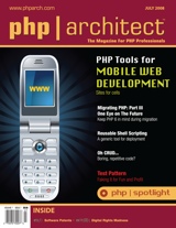
This is just a quick heads up to say that my article, "PHP Tools for Mobile Web Development" has today been published, and is currently gracing the cover of July's php|architect magazine.
Of course, I jinxed things a little by blogging that it would be published in June, but never mind, we got there.
Big thanks must go to Ciaran for giving the initial draft the once over (on a related note, check out Ciaran's post about web development for the iPhone). Thanks also to my occasional colleague Gerard for clueing me in to the fact that the damn thing had been published.
For what it's worth, php|architect is recommended reading even when I'm not in it, so get yourself over there and get subscribed!
Ok...now to crack on with that second article...
Mobilising a Website, Part 2: Strategies
In Mobilising a Website, Part 1: The Problem I noted that this site is practically unusable when viewed using the browser on a mobile handset, and that I'd like to do something about that.
This time around, I'd like to size up some of the approaches and strategies that developers can take in order to make an existing website mobile-friendly.
Option 1: Do Nothing
It may sound flippant, but in the world of development, the option of doing nothing often has to be seriously considered. Every developer out there can recount tales of ridiculous amounts of time and expense being invested in hairbrained projects developing systems that simply were not needed.
This strategy is unparalleled in its cost-effectiveness and simplicity and is naturally very, very easy to estimate and plan.
In this particular case, we could point to the fact that, as we saw, some high-end handsets do a decent enough job of displaying the site as it stands. We can confidently expect mobile browser technology to improve immeasurably over the next couple of years, so there's a lot to be said for holding off.
Unfortunately, this strategy does not solve the original problem. I want my site to work nicely for mobile users now, and it will be a long time before browsers as capable as that of the iPhone dribble down to the majority of consumers.
Moreover, I'm as interested in the process of achieving a mobile-friendly site as I am in the finished article, and that's why we're here: this series of blog posts would be rendered rather brief and anti-climactic if I were to choose the "do nothing" route!
Option 2: Add a Mobile Stylesheet
Quite a few of the problems we saw in part one, in particular those which confounded the Nokia 6230i, were related to the site's stylesheet. For example, both the fixed width of the page and the large banner images are defined in there. The former is the result of the rule width: 790px; being applied to a number of the elements within the page; the latter is specified by applying a background-image property to a <div />.
Fortunately, HTML and XHTML provide a way of specifying that a stylesheet only applies to a certain class of device. This is all achieved by applying a media attribute to the <link /> element which calls in the stylesheet.
By way of an example, the following code extract is designed to send one stylesheet to "full" or desktop web browsers (media="screen") and an alternative stylesheet to mobile browsers (media="handheld"):
<link rel="stylesheet" type="text/css" media="screen" href="full.css"> <link rel="stylesheet" type="text/css" media="handheld" href="mobile.css">
The full list of possible values for the media attribute can be found here.
Once we're serving a different stylesheet to mobile devices, we can really start to think about customising the user experience for them. For example, a mobile stylesheet could also be used to "hide" certain elements from mobile browsers, by applying a display: none; style rule to them. The long list of links in the sidebar which made the site so difficult to use with the W880i seems like a good candidate for hiding.
This strategy has the compelling benefit of simplicity. By adding one line of HTML, plus a small additional stylesheet to the site we may be able to deliver a mobile-friendly experience. Let's knock up a prototype mobile stylesheet and see how things look.
Here's a small CSS file that "hides" some of the more spurious elements of the page. I'll also specify that links should be displayed in green, purely to make it unambiguous as to whether the new stylesheet is being loaded and applied.
.sidebar {
display: none;
}
a {
color: green;
}
Remember that simply by not specifying widths, colours and background images in there, we're sidestepping a lot of the decorative fluff that was causing problems for mobile browsers.
Viewed on the Sony Ericsson, things are looking up:
Fig 1: Pointbeing.net with a handheld stylesheet, viewed on a Sony Ericsson W880i
We're successfully displaying only the main navigation, an introductory heading and paragraph, 10 links to blog posts and a footer. It's actually a really clean user experience for very little effort - I like it a lot.
Unfortunately, life isn't quite so cheerful for users of the other handsets. The experience on the Nokia 6230i and the iPhone is all but unchanged, but probably for different reasons. The Nokia does occasionally display links in green, so my hunch is that it simply does not support the media attribute, and so loads and applies both stylesheets. There's no corresponding property in WURFL to confirm it, but it certainly looks that way.
Conversely, I'm certain that the iPhone fully understands the media attribute, but considers itself to be a "real" computer. The jury's out on that one [1]. My gut feeling is that screen size should be the deciding factor in these cases, and based on that, the iPhone sits squarely under the heading of a handheld device. It's only fair to point out that the iPhone is not alone in this behaviour: the Nokia N95 and my LG KU990 behave in much the same way.
So the handheld stylesheet seemed like a great idea, but we can summarise several of the drawbacks to this approach as follows:
- Some devices do not support the media attribute at all
- Many high-end handsets completely disregard the media attribute and opt for the "full web" stylesheet
- In the cases where devices both support and honour the media attribute, we're relying on them to support CSS consistently. This is not something we can safely expect from mobile devices. For example, my first attempt was to use visibility: hidden; instead of display: none; but this was disregarded by the W880i
- Even if we hide elements by using CSS, the full page still has to be downloaded, which is likely to impose both a time and cost expense on the user. Expecting the user to download reams of markup which we don't actually want them to render seems like rather poor form. Furthermore, those full web pages may be larger than the maximum deck size which the device can support
- Pages are still not tailored to the mobile experience: Cameron Moll talks a lot about contextual relevance, and it's hard to see how my enthusiastic post about The Get Up Kids, consisting of three multi-megabyte YouTube videos embedded in the page is at all relevant to the mobile context
So this strategy isn't ideal. But for so little effort I've actually managed to make the site perfectly usable on a number of handsets. With little to lose, and with Early And Regular Delivery in mind, I'm actually going to put the handheld stylesheet in place right now, while I ponder alternative stategies.
Option 3: Allow the Site Automatically to Adapt to Devices
The principle behind this strategy is one known as "adaptive rendering". In other words, device detection would be done server-side (in my case using PHP) and the client would be sent markup and content tailored specifically to the device. I can think of a couple of ways to achieve this, although I'm sure there are plenty more.
The first option is afforded to us by the fact that the site is based firmly on the MVC pattern, which is fairly common in web sites and applications these days. MVC dictates that the business logic and data (Model), display logic (View) and application flow (Controller) be arranged into discrete components, so as to be independent of each other. In this case we're primarily concerned with the display logic, so it seems feasible to take advantage of the separation and swap in a different View component for mobile devices.
I happen to be using Zend Framework, so this could be achieved by specifying the directory in which the View should look for view scripts and helpers. I imagine it would not be difficult to do this dynamically using methods such as Zend_View_Abstract's setBasePath(), setScriptPath() and setHelperPath().
Another approach would be to adopt the "two-step view" pattern. This pattern is nicely documented by Martin Fowler in his classic Patterns of Enterprise Application Architecture, so I'll quote liberally from there:
Two Step View [splits] the transformation into two stages. The first transforms the model data into a logical presentation without any specific formatting; the second converts that logical presentation with the actual formatting needed. This way...you can support multiple output looks and feels with one second stage each
That sounds rather like what I need. I guess in terms of implementation, I'd be looking at having the first stage generating some common XML format, and then perhaps using XSL Transformations server-side in order to transform the XML into the markup which the device prefers. At the same time, I can opt not to include certain elements, such as the long list of links, in the finished pages.
Again, this can all be done within the View component of the site's code, which is rather gratifying. Still, that does seem like quite a lot of work, and I'm not sure I want to get into what would effectively be writing my own templating engine.
Option 4: Build a Separate Mobile Site
One surefire way of getting myself a working mobile version of the site would be to simply build a standalone mobile site. I've already registered the pointbeing.mobi domain name, and quite honestly do not have any better ideas for what to do with it.
The benefits of this approach would be that I could tailor the mobile site exactly the way I want it, I could roll out features incrementally, and I wouldn't risk making the main Pointbeing.net site's code any more complex than it need be. Admittedly it's pretty simple stuff right now, but I'd like to keep it that way.
I could detect mobile devices as they hit the main site (perhaps using Tera-WURFL) and forward them across to the mobile version. This is a strategy used by a fair number of large sites, such as Flickr (mobile version) and Facebook (mobile version), so it seems like I'd be in good company.
The downsides would be that I would have two sites to maintain, and that I still would not have solved the original problem, that of Pointbeing.net being a bit of a dog when viewed on a mobile browser. That said, if I leave the handheld stylesheet in place, I'd be catering to most cases.
The important thing to remember will be to always provide a link back to the full site for users who feel confident that their browsers will cope with it. I'm not interested in forbidding any users from accessing any content whatsoever: that's too much of a throwback to the dark days of the desktop web when sites would block, say, Opera users, demanding that they to "upgrade" to IE5 in order to gain access.
Conclusions
Creating a standalone mobile-friendly site - either under the .mobi domain or under an "m." subdomain - and forwarding mobile devices on to it is an appealing option, and it's the one towards which I'm leaning right now. I think...
I may well change my mind and opt for the adaptive rendering path. While that route feels a little more ambitious, I certainly would be quite proud if I could pull it off, and have the site adapt itself to devices as if by magic.
Either way, I'm going to have to put some thought into which tools and libraries I'm going to use to create mobile-friendly pages. There's a few out there, some of which I've covered on this site, some in a recent piece I wrote for php|architect, and yet others with which I'm not at all familiar.
Part 3 of this series seems like a good time to start making some decisions about toolkits, and this will in turn entail making some architectural decisions about the code behind the mobile version of pointbeing.net.
Footnotes
[1] Similarly, the debate about whether to deliver "full web" content or a mobile tailored version to such devices continues. A useful piece on the subject appeared recently over at WAP Review.
Many thanks to my colleague Dan Gent, whose remarkably well-timed loan of Cameron Moll's Mobile Web Design helped to inform this post.
Previous Posts in this Series:
Benchmarking Zend Download Server
Recently I've started looking into ways that the PHP dev team in which I work can make better use of our Zend Platform installation.
For that reason, the recent Ibuildings/Zend seminar in London on the subject of "Enterprise PHP" was well timed, as it included a pretty detailed run through of a lot of what Platform has to offer.
One feature which really struck me as having the potential to bring performance benefits to one of our systems was the Zend Download Server. Back at the office, I looked into the feature, and ran a few benchmarks. Oddly though, the results don't seem to flatter Zend Download Server.
Zend Download Server
The premise behind Zend Download Server (ZDS) is that tying up valuable Apache HTTPD threads purely to serve static content is overkill, and far from efficient.
This is the same reason why lightweight webservers such as lighttpd are becoming popular. Lightweight webservers are typically run alongside a more powerful server such as Apache, and are dedicated to serving static content, leaving more Apache threads free to deal with the dynamic - for example PHP-based - requests.
ZDS follows that principle, although it works a little differently to lighttpd: it runs as a standalone process, but it hijacks a single Apache thread, thus allowing Apache to delegate the relevant requests down to ZDS.
ZDS can be utilised in a couple of ways. Firstly, there's 'transparent mode', whereby the administrator configures Platform in advance, telling it to hand specific downloads (say, all JPGs and GIFs over 128KB) off to ZDS.
The second option is 'manual mode', whereby the developer hooks directly into ZDS using a simple call to the proprietary zend_send_file() function. zend_send_file() is designed as a drop in replacement for functions such as fpassthru(), which simply read in the contents of a file and send them to output (in this case the HTTP response).
zend_download_file() seemed ideal for my needs, but not wishing to break the third rule of optimization, I decided to do a little benchmarking before I got too excited.
Benchmarking ZDS
I compared the two simplest possible scripts I could come up with. This first example uses the built-in PHP function, fpassthru():
<?php
$file = fopen('cat2.jpg', 'r');
fpassthru($file);
And here's the amended version of the script, using zend_send_file()to deliver the file:
<?php
zend_send_file('cat2.jpg');
Pretty straightforward stuff, all in all. Both scripts are delivering the same file, a JPG image of slightly less than 500KB.
I threw some load at the script using the ab benchmarking tool that ships with Apache HTTPD. Here's an example of the kind of command I ran:
./ab -n 200 -c 10 http://platform/deliver_file.php
The -n argument specifies the total number of requests, while -c specifies the number of concurrent requests that ab will try to make.
Here's an abridged version of the output using fpassthru():
Time taken for tests: 8.849252 seconds
Requests per second: 22.60 [#/sec] (mean)
Time per request: 442.463 [ms] (mean)
Time per request: 44.246 [ms] (mean, across all concurrent requests)
Transfer rate: 10818.09 [Kbytes/sec] received
Connection Times (ms)
min mean[+/-sd] median max
Connect: 2 87 514.0 14 4082
Processing: 96 337 182.3 281 1127
Waiting: 9 65 64.4 41 366
Total: 106 425 540.2 309 4364
Percentage of the requests served within a certain time (ms)
50% 309
66% 383
75% 463
80% 495
90% 613
95% 785
98% 3241
99% 4224
100% 4364 (longest request)
And the output using zend_send_file():
Time taken for tests: 8.886843 seconds
Requests per second: 22.51 [#/sec] (mean)
Time per request: 444.342 [ms] (mean)
Time per request: 44.434 [ms] (mean, across all concurrent requests)
Transfer rate: 10721.58 [Kbytes/sec] received
Connection Times (ms)
min mean[+/-sd] median max
Connect: 1 82 530.4 15 4420
Processing: 62 338 183.1 285 1069
Waiting: 12 41 20.1 38 148
Total: 63 420 595.1 304 5022
Percentage of the requests served within a certain time (ms)
50% 304
66% 370
75% 500
80% 545
90% 640
95% 741
98% 1096
99% 4992
100% 5022 (longest request)
I tried a few combinations of the various parameters available to ab, and quite honestly couldn't find any conclusive difference in performance between using ZDS and not using it. In fact, under low or very high load, zend_send_file() seemed to slow things down a little.
Conclusions
I'm pretty surprised - enough to doubt the validity of my tests, I admit. I don't believe for a minute that Zend would make false claims for features of their flagship product, so I must be doing something wrong. But what?
I'm aware that I'm measuring network speed as much as anything, and that the claimed benefits of ZDS centre around reduced load on the server side. But still, who cares if load is down when, at the end of the day, performance doesn't improve?
The one concrete lesson that I can offer up from all of this is that it's always valuable to follow the third rule, and Profile Before Optimizing.
Fighting Spam and Digitising Books with reCAPTCHA
When I added a comment form to this blog, I wondered how long it would be before I started getting comment spam. Then I wondered if I was flattering myself to think that spam bots would even be interested in my site.
So it's with mixed emotions that I have to admit that right now the number of spam comments I'm receiving is outstripping the number of genuine comments by a ratio of about 10:1.
The time has come to add a CAPTCHA to the comment form.
The Wikipedia article describes the CAPTCHA concept adequately, so I'll merely summarise that a CAPTCHA is a simple test that the poster of the comment is human. I show you a picture of some wonky-looking text, and you type the words you see into the box provided.
Fig 1: Some wonky-looking text
If you correctly identify the words, I'll assume that you're a real person, and not an evil bot. And your comment will get posted. Simple as that.
reCAPTCHA
I had been meaning to have a play with reCAPTCHA since it caught my eye a few months back. It's a great idea: a totally free CAPTCHA tool, developed by Carnegie Mellon University, that anyone can use on their website.
What makes reCAPTCHA special is that at the same time as you're reading that wonky text and entering the words in the box, you're playing your part in a global effort to digitise pre-computer era books, by deciphering the words that OCR software struggles with. There's a more detailed overview of the project here.
It's kind of a cool idea, so I'm going to co-opt reCAPTCHA to help me fend off those evil spammers. I won't be alone: reCAPTCHA counts sites as large as Facebook, Twitter and StumbleUpon among its users [1].
Implementation
The first step in using reCAPTCHA is to drop in at the reCAPTCHA site and get yourself an account. Of course, you'll have to fill in a reCAPTCHA to do this!
As part of the signup process, you'll be prompted to request a key for your first domain (each key is restricted for use on only one domain, apparently for security reasons). In fact, you receive both a public and a private key, and we'll see how to use those shortly. The whole process takes about two minutes.
Once you're signed up, you're free to start implementing reCAPTCHA. For us PHP users, this is delightfully simple, as the reCAPTCHA guys have thoughtfully knocked up a small library to wrap their API. You can download the library from the project's Google Code pages.
Simply download the code, and unzip it somewhere sane and accessible on the webserver. I'll refer to the installation directory as /path/to/recaptcha for the purposes of this post.
To begin using reCAPTCHA, we'll start by adding some HTML to the comment form in order to display the reCAPTCHA challenge box. The library generates all the HTML we need:
<?php
require_once '/path/to/recaptcha/recaptchalib.php';
// public key as provided during the signup process
$publickey = '...';
echo recaptcha_get_html($publickey);
It really is that simple, and the reCAPTCHA challenge box shows up as if by magic. With its default theme, it looks like so:
Fig 2: The default reCAPTCHA challenge box
Drop that HTML into the appropriate place in whichever form you want to protect from spam. Once the form is submitted, you can check the validity of the submission as follows:
<?php
require_once '/path/to/recaptcha/recaptchalib.php';
// private key as provided during the signup process
$privatekey = '...';
$resp = recaptcha_check_answer(
$privatekey,
$_SERVER['REMOTE_ADDR'],
$_POST['recaptcha_challenge_field'],
$_POST['recaptcha_response_field']);
if ( $resp->is_valid ) {
// assume the user is human
// so post the comment
} else {
// CAPTCHA was not entered correctly
// so redisplay the form
}
Job done, basically. You can theme the actual reCAPTCHA box - to an extent - quite easily, which is nice as the default beige and maroon jarred a little with my fetching grey and turquoise getup. To do that, add a small snippet of Javascript to the form page:
<script type="text/javascript">
var RecaptchaOptions = {
theme : 'white',
};
</script>
There is also a 'custom' theme which gives you a lot more control over the look and feel, but for the time being I stuck with 'white'. The whistles and bells can wait!
That's really all there is to it. If you like, you can see the finished comment form, replete with reCAPTCHA, for this post. Time will tell what effect this has the amount of spam I receive.
Footnotes
Zend_Search_Lucene Quick Start
I recently had a spontaneous urge to add a search form to my weblog - this one you're reading right now - and it seemed like a good opportunity to have a look at Zend_Search_Lucene.
I'm really impressed with the simplicity and power of the module. Sadly the documentation, whilst extensive, isn't particularly clear - so here's a quick overview of getting Zend_Search_Lucene up and running.
For the uninitiated, Apache Lucene is an open-source indexing and search tool written in Java, and Zend_Search_Lucene is the purely PHP5 implementation of Lucene [1] that ships with Zend Framework.
Indexing
Before we can do any searching, we need to initialise an index. This is done through the Zend_Search_Lucene::create() method. Indexes are stored on disk, so we will need to create a directory which is readable and writeable by whichever user the script will run as. I've imaginatively called that /path/to/index for the purposes of this post.
Here's an example script which initialises the index, and adds three documents to it, ready for searching:
<?php
$index = Zend_Search_Lucene::create('/path/to/index/');
$doc = new Zend_Search_Lucene_Document();
$doc->addField(
Zend_Search_Lucene_Field::unIndexed(
'title', 'Item number 1') );
$doc->addField(
Zend_Search_Lucene_Field::text(
'contents', 'cow elephant dog hamster') );
$index->addDocument($doc);
$doc = new Zend_Search_Lucene_Document();
$doc->addField(
Zend_Search_Lucene_Field::unIndexed(
'title', 'Item number 2') );
$doc->addField(
Zend_Search_Lucene_Field::text(
'contents', 'cow aardvark dog hamster') );
$index->addDocument($doc);
$doc = new Zend_Search_Lucene_Document();
$doc->addField(
Zend_Search_Lucene_Field::unIndexed(
'title', 'Item number 3') );
$doc->addField(
Zend_Search_Lucene_Field::text(
'contents', 'cow elephant dog esquilax elephant') );
$index->addDocument($doc);
$index->commit();
It's important not to overlook that final call to commit() - nothing will work without that. The 'title' field is unIndexed as we won't be searching on it, merely displaying it in our list of results. The 'contents' field is text, and this will be indexed for searching.
Where you get your document data from is completely up to you. It might be an RSS feed, a website crawler or - as in my case - a tiny PHP cron script which queries the weblog table in my database.
Either way, that's our index created. Since an index is no use unless you query it, let's have a look at how we can do that.
Searching
Here's about the simplest search you can possibly do with Zend_Search_Lucene:
<?php
$index = Zend_Search_Lucene::open('/path/to/index/');
$results = $index->find('contents:elephant');
foreach ( $results as $result ) {
echo $result->score, ' :: ', $result->title, "\n\";
}
The 'contents:elephant' query specifies that we wish to search for documents whose 'contents' field contains the term 'elephant'. That runs in a flash, and produces the following output:
0.61871843353823 :: Item number 3 0.5 :: Item number 1
As you can see, the two Zend_Search_Lucene_Document objects which contain the word 'elephant' are returned, ordered by descending 'score'. Item 3 contains the word twice, which is why it receives the highest score.
Of course, there are far more features than I've even hinted at here, so I'll more than likely return to Zend_Search_Lucene in a further post looking at some of the more advanced stuff, but for now, that's your lot.
Footnotes
[1] Incidentally, the index files created by Zend_Search_Lucene are entirely compatible with those created by Apache Lucene, allowing the two implementations to interoperate happily, should the need arise.
My php|architect Article to be Published in June
I purposefully didn't mention this here before now, as I didn't want to jinx anything.
But the time has come, and I'm pleasantly surprised to be able to report that my article - named something along the lines of "PHP Tools for Mobile Web Development" - is to be published in the June edition of php|architect magazine.
This will be my first ever contribution to php|architect, so it's a huge compliment that as well as being published somewhat sooner than expected, it looks like becoming the cover feature for June.
We're currently in the final stages of editing, and I'm really enjoying working with editor Steph Fox to turn this into something worth publishing. Stay tuned for further news.
PHPTuring
A few years ago, as an exercise in Test-Driven Development, I wrote a Turing machine simulator in PHP and imaginatively named it PHPTuring.
I had completely forgotten about it until today, when I dug it out for another look. Truth be told, I still haven't seen a Turing machine done any better in PHP, and apart from a few syntactical niceties (removing closing PHP tags as per the Zend way, neatening up the PHPDoc blocks) I'm actually pretty comfortable with the code.
Using it is a breeze. It reads pipe-separated tapes and newline plus pipe-separated instruction sets like so:
<?php
$prog = '0|1|1|R|0\n0||1|R|1\n1|1|1|R|1\n1|||L|2\n2|1|||stop';
$tape = '1|1|1|1|1|1||1|1|1|1|1|1|1|1';
$machine = new Machine();
$compiler = new SimpleCompiler();
$parser = new SimpleTapeParser();
$debugger = new SimpleDebugger();
$debugger->watch($machine);
header('Content-type: text/plain');
$machine->run($compiler->compile($prog), $parser->parse($tape));
It should work with other formats, so long as someone writes parsers for them. Similarly, the debugger is just an Observer that dumps the state and tape to the screen at each step, but it could easily do something more subtle some day.
The code ships with full tests, and is available for download on PHPTuring's Sourceforge download page.
So why am I banging on about it here? I don't know. Maybe just because I like it, because it was the first afternoon's coding that really got me test-infected, and because I'd be interested in any feedback.
An Introduction to Tera-WURFL
I recently added a post about Wurfl, a comprehensive open-source XML database of mobile device capabilities. I noted that actually querying Wurfl in a performant manner:
is going to be a non-trivial task, and is perhaps a topic for a further article.
Well, I guess this is that article. It's time to have a look at Tera-WURFL, which is perhaps the most popular tool for querying Wurfl programmatically - from PHP, at least.
Tera-WURFL
Tera-WURFL is a PHP library written by Steve Kamerman, and made freely available to the public. The developers claim querying Tera-WURFL to be five to ten times faster than querying Wurfl directly with PHP, but in practice the performance benefits tend to be much higher, not to mention the greatly improved convenience of having a PHP library already written for you.
The key features of Tera-WURFL can be summarised as follows:
- A MySQL database containing data parsed from Wurfl itself
- A small PHP library which encapsulates querying the database, and provides a simple object interface to the data
- A web interface which makes it a breeze to retrieve the latest version of Wurfl from Sourceforge, and to import it into your local database
Installation and Configuration
Installing Tera-WURFL is pretty painless. It comes with full installation instructions so I won't go into too much detail here. Suffice to say that you'll need to download the latest version (currently 1.5.2) from the site, and either unzip it into a directory which is accessible via the web, or unzip it elsewhere, and create a symlink to it from a web directory. This is so that you can later browse to Tera-WURFL's admin interface in order to import or update WURFL.
You will also need to create an empty MySQL database for Tera-WURFL, and make sure that you have a MySQL user account which has full permissions on that database. Place the details of the database and the user account into the relevant slots in tera_wurfl_config.php, which lives in the root of the unzipped folders, and you're ready to go.
Querying Tera-WURFL
Once everything is installed and configured, accessing Tera-WURFL from within a PHP application is trivially easy:
<?php
require_once '/path/to/tera_wurfl/tera_wurfl.php';
$device = new Tera_Wurfl();
$device->getDeviceCapabilitiesFromAgent(
$_SERVER['HTTP_USER_AGENT']);
That's really all there is to it, from a user's perspective. $device is now a large object with comprehensive information regarding the device and its capabilities.
Let's try a concrete example, that of Nokia's popular N95 handset, which identifies itself with the HTTP User-Agent string:
Mozilla/5.0 (SymbianOS/9.2; U; Series60/3.1 NokiaN95/11.0.026;
Profile MIDP-2.0 Configuration/CLDC-1.1)
AppleWebKit/413 (KHTML, like Gecko) Safari/413Passing that string into the getDeviceCapabilitiesFromAgent() method, and calling print_r() on the resulting object provides us with output similar to the following:
array (
'id' => 'nokia_n95_ver1_sub_mozilla_b',
'user_agent' => 'Mozilla/5.0 (SymbianOS/9.2; U;
Series60/3.1 NokiaN95/11.0.026; Profile/MIDP-2.0
Configuration/CLDC-1.1 )
AppleWebKit/413 (KHTML, like Gecko) Safari/413',
'fall_back' => 'nokia_n95_ver1',
'product_info' =>
array (
'brand_name' => 'Nokia',
'model_name' => 'N95',
'unique' => true,
'ununiqueness_handler' => '',
'is_wireless_device' => true,
'device_claims_web_support' => true,
'has_pointing_device' => false,
'has_qwerty_keyboard' => false,
'can_skip_aligned_link_row' => true,
'uaprof' =>
'http://nds1.nds.nokia.com/uaprof/NN95-1r100.xml',
'uaprof2' => '',
'uaprof3' => '',
'nokia_series' => 60,
'nokia_edition' => 3,
'device_os' => 'Symbian OS',
'mobile_browser' => 'Nokia',
'mobile_browser_version' => '',
),
// snip
'xhtml_ui' =>
array (
'xhtml_honors_bgcolor' => true,
'xhtml_supports_forms_in_table' => false,
'xhtml_support_wml2_namespace' => false,
'xhtml_autoexpand_select' => false,
'xhtml_select_as_dropdown' => false,
'xhtml_select_as_radiobutton' => false,
'xhtml_select_as_popup' => false,
'xhtml_display_accesskey' => false,
'xhtml_supports_invisible_text' => false,
'xhtml_supports_inline_input' => false,
'xhtml_supports_monospace_font' => false,
'xhtml_supports_table_for_layout' => true,
'xhtml_supports_css_cell_table_coloring' => false,
'xhtml_format_as_css_property' => true,
'xhtml_format_as_attribute' => false,
'xhtml_nowrap_mode' => false,
'xhtml_marquee_as_css_property' => false,
'xhtml_readable_background_color1' => '#FFFFFF',
'xhtml_readable_background_color2' => '#FFFFFF',
'xhtml_allows_disabled_form_elements' => false,
'xhtml_document_title_support' => true,
'xhtml_preferred_charset' => 'utf8',
'opwv_xhtml_extensions_support' => false,
'xhtml_make_phone_call_string' => 'wtai://wp/mc;',
'xhtmlmp_preferred_mime_type' => 'application/xhtml+xml',
'xhtml_table_support' => true,
'xhtml_send_sms_string' => 'none',
'xhtml_send_mms_string' => 'none',
'xhtml_supports_file_upload' => true,
'xhtml_file_upload' => 'supported',
),
'ajax' =>
array (
'ajax_support_javascript' => true,
'ajax_manipulate_css' => true,
'ajax_support_getelementbyid' => true,
'ajax_support_inner_html' => true,
'ajax_xhr_type' => 'standard',
'ajax_support_full_dom' => true,
),
// snip
'display' =>
array (
'resolution_width' => 240,
'resolution_height' => 320,
'columns' => 15,
'max_image_width' => 229,
'max_image_height' => 300,
'rows' => 6,
),
'image_format' =>
array (
'wbmp' => true,
'bmp' => true,
'epoc_bmp' => true,
'gif_animated' => true,
'jpg' => true,
'png' => true,
'tiff' => true,
'transparent_png_alpha' => false,
'transparent_png_index' => false,
'svgt_1_1' => false,
'svgt_1_1_plus' => false,
'greyscale' => false,
'gif' => true,
'colors' => 262144,
),
// snip
'sound_format' =>
array (
'wav' => true,
'mmf' => false,
'smf' => false,
'mld' => false,
'midi_monophonic' => true,
'midi_polyphonic' => true,
'sp_midi' => true,
'rmf' => true,
'xmf' => true,
'compactmidi' => false,
'digiplug' => false,
'nokia_ringtone' => true,
'imelody' => false,
'au' => true,
'amr' => true,
'awb' => true,
'aac' => true,
'mp3' => true,
'voices' => 64,
'qcelp' => false,
'evrc' => false,
),
// snip
)
We can immediately see a lot of useful information there, such as the exact make and model of the handset, the screen dimensions, and the various sound and image formats which the device supports. Note that I've snipped the output considerably there, as the real object contains a great deal of data. Some notable items I've left out include:
- Level of J2ME support
- Details of MMS, SMS and Wap Push capabilities
- DRM support
- Known bugs
To see the object in its entirety, feel free to query the database using the form I have hosted here. This is a very slightly modified version of a tool which ships with Tera-WURFL, and should give you a feel for the level of detail you can expect.
Performance
I mentioned earlier that actually querying Tera-WURFL is pretty quick and efficient. To see why, we'll need to look at what happens behind the scenes.
Here's some ad hoc performance stats for the Nokia N95 we looked at just now:
Time to load tera_wurfl_class.php:0.004951000213623 Time to initialize class:0.00052809715270996 Time to find the user agent:0.5135498046875 Total:0.51902890205383 Total Queries: 95
I know what you're thinking: half a second is a little sluggish. No wonder, when we're making ninety-five queries! But let's hit 'refresh' and try once more. The output for a subsequent query is as follows:
Time to load tera_wurfl_class.php:0.0053188800811768 Time to initialize class:0.00048208236694336 Time to find the user agent:0.00093793869018555 Total:0.0067389011383057 Total Queries: 1 (Found in cache)
That's more like it. As the initial generation of the Tera_Wurfl object is so query-intensive, Tera-WURFL (since version 1.5) caches it in a dedicated table as a serialised string. That means that subsequent requests for the same user-agent are reduced to one single-table query against a primary key, which is about the swiftest thing you can do with a database[1]. Combine that with MySQL's built-in query caching and we're really flying.
Applications
Of course, how you actually put Tera-WURFL to work for you is up to you. You may choose to use it to automatically tailor wallpapers and other graphics to screen sizes, to determine whether or not a user can support your J2ME app, or adapt markup to specific mobile browsers. In fact, a future post may look at Wall4PHP, a tag library which, handily enough, comes bundled with Tera-WURFL, and can be used to automatically adapt mobile web pages to the browser on which they are being viewed.
Still, for the time being, I hope this has given a reasonable introduction to what Tera-WURFL can offer the mobile developer.
[1] It will be even faster if we change the table storage engine to InnoDB, as opposed to the default MyISAM. This is because InnoDB's use of clustered indexes makes lookups against primary keys extremely efficient.
Managing Mobile and Non-mobile Versions of a Site Using Tera-WURFL and Zend Framework
This is a quick proof-of-concept I put together after a discussion on how to deal with running a mobile site and a 'full' web site on the same hostname in a sane way, and to transparently route user agents to the appropriate site.
Steps Involved
i) Organise the 'Web' and 'Mobile' sites as separate Modules in Zend Framework
This way, any users accessing URLs beginning /mobile (or whichever path we nominate) will automatically be routed to the controllers in the Mobile module and users accessing URLs beginning /web will be routed into the Web module.
ii) Add a 'Default' Module
Users will be routed to this if they access any other path, such as / or /ringtones
The configuration for this in the bootstrap looks a little like this:
<?php
$frontController->setControllerDirectory(array(
'default' => '../application/modules/default/controllers',
'web' => '../application/modules/web/controllers',
'mobile' => '../application/modules/mobile/controllers',
));
That tells the FrontController where to look for the right controllers.
iii) Query Tera-WURFL to identify the device
I chose to do this as a ControllerPlugin, as this will be run regardless of the user's entry URL.
<?php
require_once '/path/to/tera_wurfl/tera_wurfl.php';
class TwurflPlugin extends Zend_Controller_Plugin_Abstract {
/**
* Only ever called once at the start of dispatch
* @access public
*/
public function dispatchLoopStartup(
Zend_Controller_Request_Abstract $request)
{
$tw = new Tera_Wurfl();
$tw->getDeviceCapabilitiesFromAgent(
$request->getHeader('User-Agent'));
Zend_Registry::set('twurfl', $tw);
}
}
...and register that with the FrontController like so:
<?php
$frontController->registerPlugin(new TwurflPlugin());
A nice side effect is that the Tera_Wurfl object is pulled from the database once and once only, and is thereafter available via the Zend_Registry for the lifetime of the request.
iv) Use the IndexController of the Default module to route requests into the appropriate module
<?php
class IndexController extends Zend_Controller_Action {
/**
* Called automatically by ZF before a *Action()
* method is called
*
* @access public
*/
public function init()
{
$this->_helper->viewRenderer->setNoRender(TRUE);
}
/**
* Called by magic
*
* @access public
*/
public function __call($methodname, $args)
{
$tw = Zend_Registry::get('twurfl');
if ( $tw->browser_is_wap ) {
$this->_forward(
$this->_request->getActionName(),
$this->_request->getControllerName(),
'mobile');
//$this->_redirect('/mobile');
} else {
$this->_forward(
$this->_request->getActionName(),
$this->_request->getControllerName(),
'web');
}
}
}
Note the use of the PHP5 __call() magic method, which effectively gives us wildcarding of URLs, so we don't need to create an action method for every possible path.
Outcome
- Users can, should they wish, access each site from any device, by explicitly browsing to the relevant URL
- Users not specifying /mobile or /web will be detected and routed to the correct site
- This does not require any browser redirects - it's transparent to the end user
- URLs such as /ringtones or /sendtoafriend will work transparently allowing the appropriate controllers to handle them as they see fit
- For such time as the mobile site is not Zend Framework based, we can replace the forward() with a redirect() as per the line commented out in the previous example


